

When I first started learning to paint model horses, my eye saw the horse as one color, or maybe, in the case of bay, two colors. The reddish brown, and the black, and oh maybe try to blend them together where they meet.
The next thing I learned was to put some highlights on the high points and some darker paint in the grooves. Still not right. The color was still flat, and maybe not even that realistic a shade.
Carol Williams, with her original Color Formulas and Techniques pamphlet, taught me to look past what I thought I saw. Despite what the horse books said, chestnut wasn’t actually one color across the whole horse. She showed me where the hairs were lighter and darker, and taught me to trust my eye instead of what I had been told. It was a revelation, plus her formulas. I learned to paint smoothly, and create some life in my pieces. I pushed past what she taught, adding more variation throughout the coat, building more contrast.
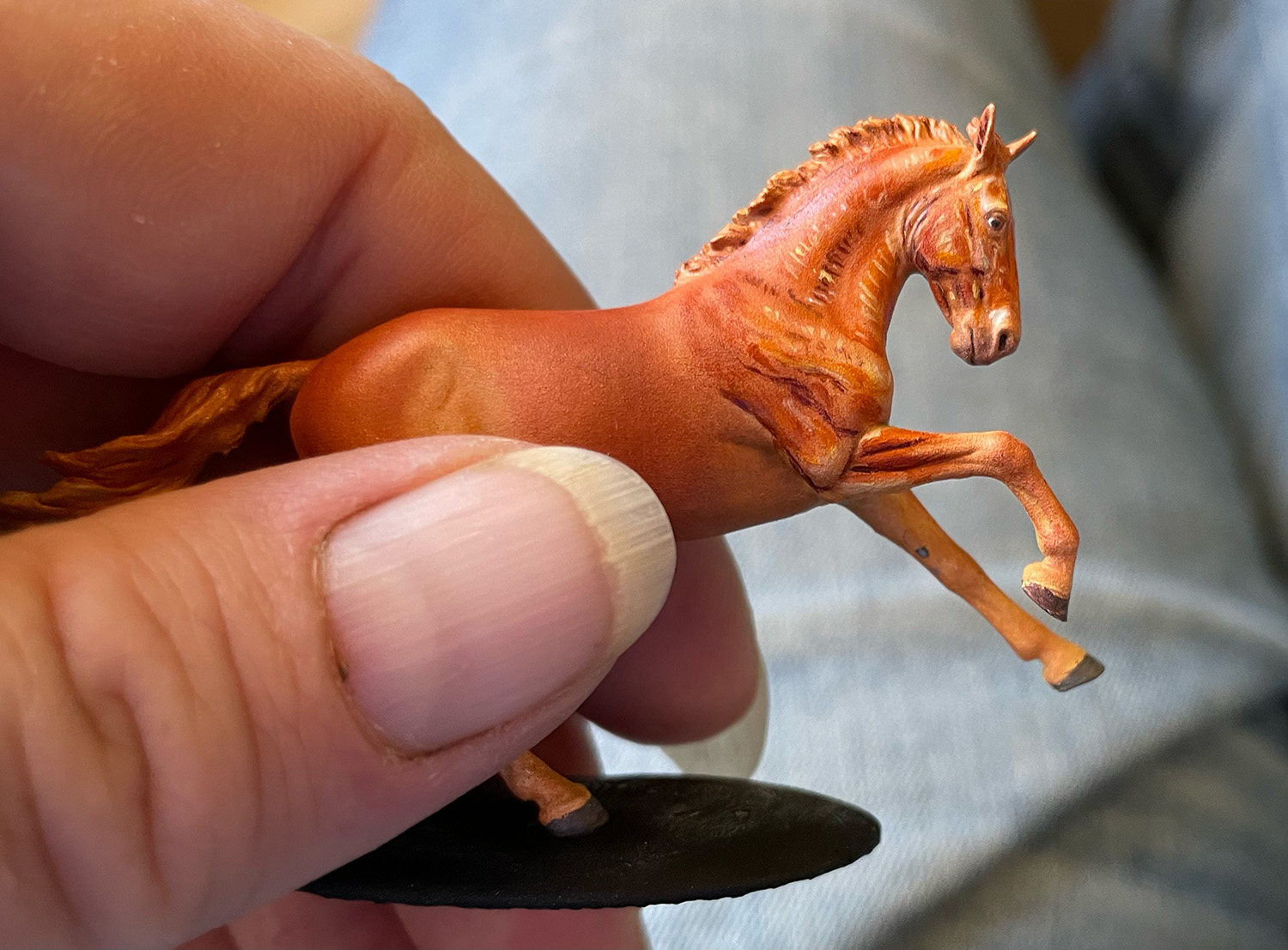
The title image: chestnut micro Hazel by Morgen Kilbourn in progress, layer two or three of chestnut, before blending, early stage of building contrast. Paintwork by Elaine Lindelef
But even then, I was still very much stuck in what was expected. I used horse colors. I pushed them, but I still made my light static, still based what I painted on what I expected was there instead of what actually was there. I expected the form to do the work for me.
It’s been a revelation to see what people have done with medallions, an in-between state of flatwork and 3D, where aggressive and erratic use of color can really make a piece pop. Highlights on a real horse AREN’T smooth and predictable. They dance. They wiggle. They reflect based on the structure underneath as well as the hair color and hair direction. They’re purple and green and blue. They bounce off of different depths in the eye. Lynn Cassels-Caldwell in particular does magic with her highlights.
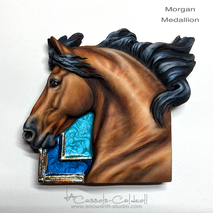
Lynn Cassels-Caldwell paintwork on Sarah Minkiewicz Morgan cubequine. She’s not afraid to use white, and the highlights absolutely dance across the piece, moving your eye around, working with the sculpture but not overwhelming it. Yes, you can highlight a black mane and it works.
Melanie Miller did a NaMoPaiMo horse using color pickers a few years back, aggressively using digital tools to pick out color from a reference image and match it exactly. What a revelation that was, to see how different the actual colors were! And mixing paints from primaries has also taught me so much about color and freedom.
I still have so much to learn. But I love watching everyone push the envelope and bring in, and share, incredible new-to-me ideas for painting. Some from old masters, some from the latest digital tools. And the decorator style customs, where we’re excited to paint rainbow and pink and purple horses helps too, teaching us to reach outside of the old norms.
The bar for excellent work is high. And there’s never been a better time to be a model horse artist, with so many working professionals who truly have had the time to perfect their craft, and who in turn have been willing to document and share.
What’s the thing you learned that BLEW YOUR MIND and changed how you approach your art?
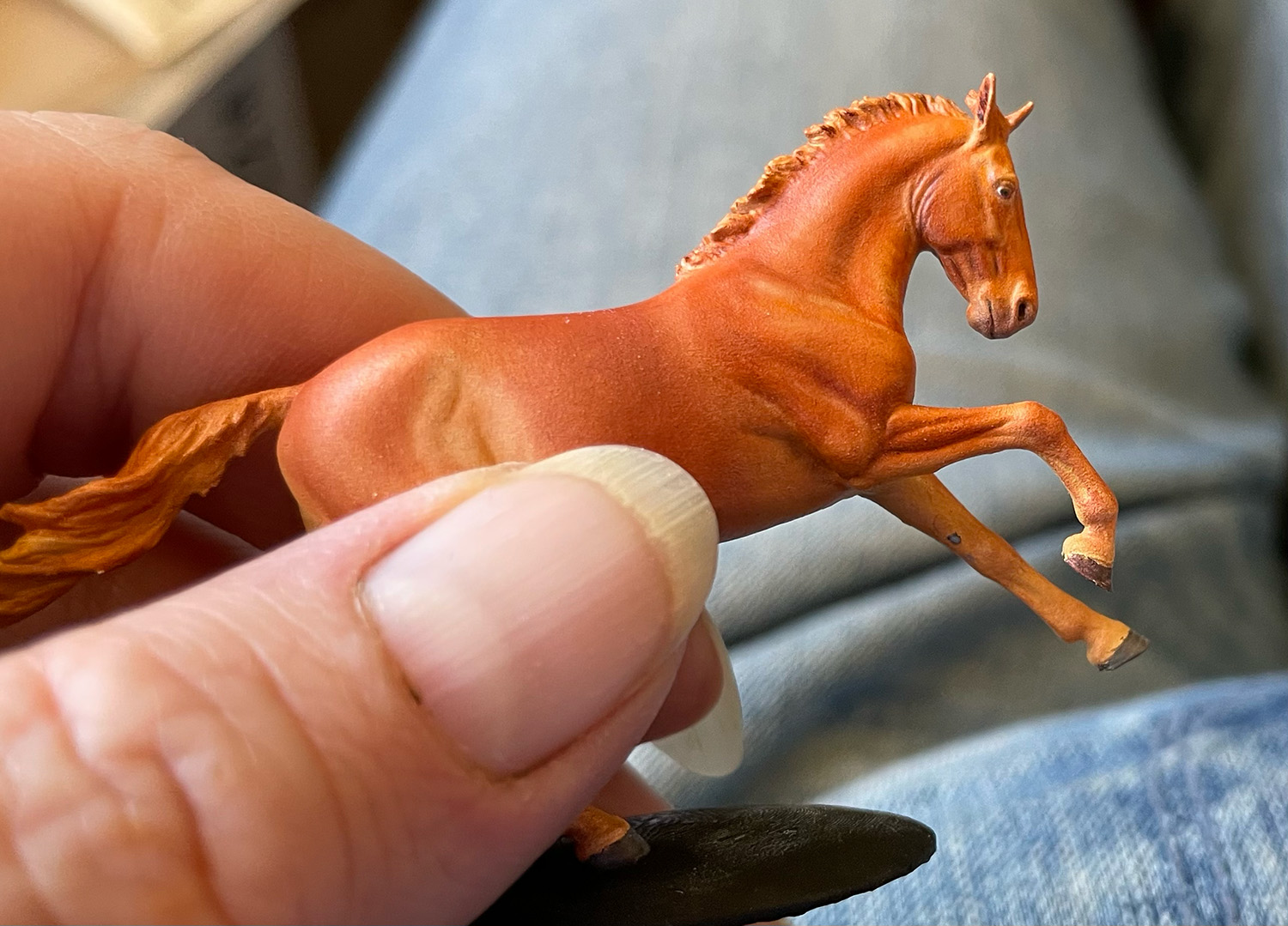
Chestnut micro Hazel by Morgen Kilbourn in progress, layer two or three of chestnut, the work in the title image blended, paintwork by Elaine Lindelef
Consider this very ordinary picture of a chestnut (the sepia tone comes from the nd1 gene) in summer coat. The highlights aren’t uniformly or smoothly on the high points of the muscles or body - they zig and zag, interacting with the light direction, the body shape, and the hair.
The challenge for us: how do we get an effect like this to feel natural and appropriate and appealing when we move the model between different light sources and directions?